
It is often suggested that modern viewers dislike painted reconstructions of Greek and Roman statues because our taste differs from that of the ancients. This essay proposes an alternative.

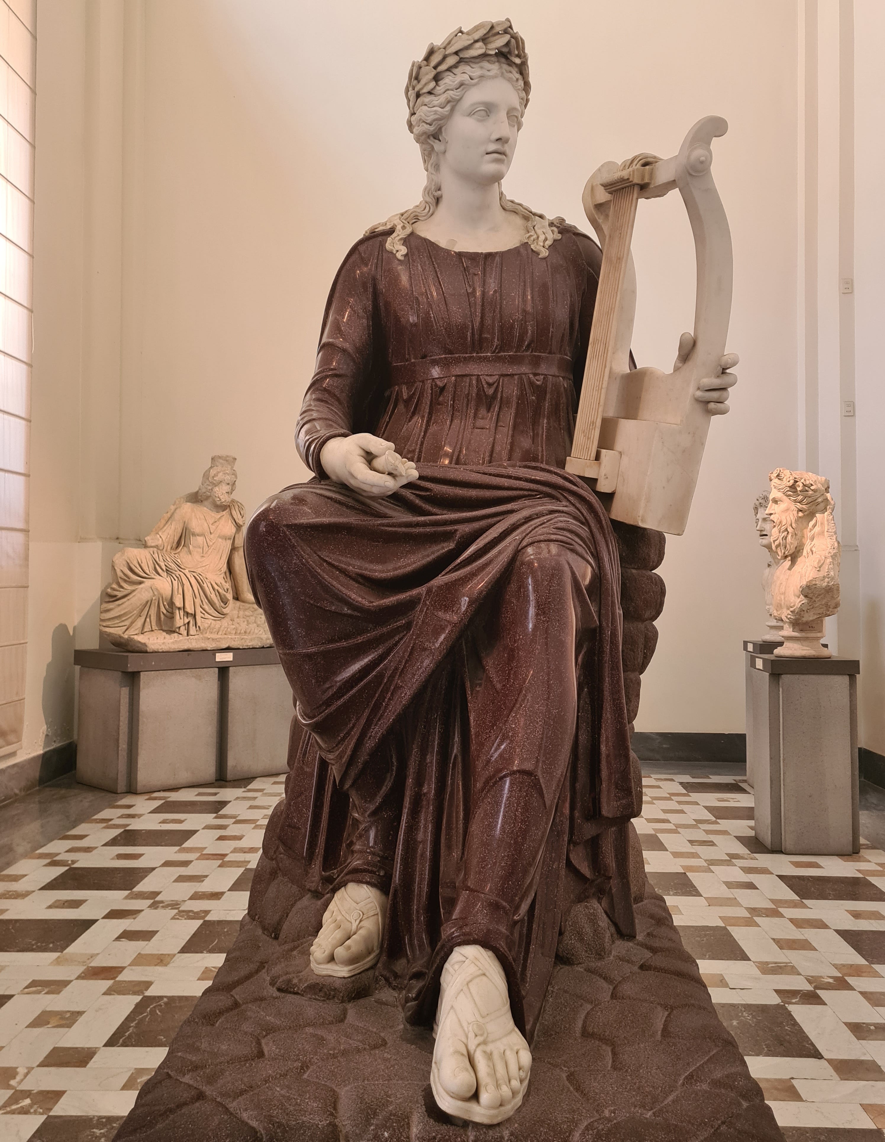
This is a Roman statue located in the British Museum.
It depicts the goddess Venus, perhaps originally holding a mirror. Something you will notice about it is that it looks great.

Subscribe for $100 to receive six beautiful issues per year.
Below is a Greek sculpture from half a millennium earlier.

One of the treasures recovered from the first-century BC Antikythera shipwreck, this statue is composed of bronze with inlaid stone eyes. It has been variously interpreted as representing Paris, Perseus, or a youthful Heracles. Whatever interpretation is correct, it is a stunning work of art.
Here is a detail from a wall painting in Rome. This has undergone two thousand years of wear and tear, but it is still beautiful to us.

There is a general pattern to these observations. Ancient Greek and Roman art tends to look really good today.
This is not a universal rule. The Greeks weren’t always the masters of naturalism that we know: early Archaic kouroi now seem rather stilted and uneasy. As in all societies, cruder work was produced at the lower end of the market. Art in the peripheral provinces of the Roman Empire was often clearly a clumsy imitation of work at the center. Even so, modern viewers tend to be struck by the excellence of Greek and Roman art. The examples I have given here are far from exceptions. Explore the Naples Archaeological Museum, the British Museum, the Louvre, or the Metropolitan Museum and you will see that they had tons of this stuff. Still more remarkable, in a way, is the abundance of good work discovered in Pompeii, a provincial town of perhaps 15,000 people.
Here is another Roman statue, this time depicting the Emperor Augustus. It is called the Augustus of the Prima Porta after the site where it was discovered. Something interesting about this statue is that traces of paint survive on its surface. This is because, like most though not all ancient statues, it was originally painted.

You were probably already aware of this. The coloring of ancient sculpture has become widely known in recent years as a result of several high profile projects purporting to reconstruct the original appearance of these works – most famously, Vinzenz Brinkmann’s travelling Gods in Color exhibition. This was not news to historians, who have been aware that ancient sculpture was colored (polychromatic) since the 1800s. But it took these striking reconstructions to galvanize public interest.
Here is Brinkmann’s well-known reconstruction of the Augustus of the Prima Porta.

What do you notice about this reconstruction? That’s right, it looks awful. In the eyes of modern viewers, at least, the addition of this matte, heavily saturated color has turned a really good work of art into a really bad one.
Look at this archer, from the pediment of the late archaic temple of Aphaia on Aegina.

I have not said anything novel here. Everybody knows these reconstructions look awful. The difficult and interesting question is why this is so.
The changing taste theory
The explanation usually given is that modern taste differs from that of the ancient Greeks and Romans. It follows that, if the reconstructions are accurate, their taste must be very alien to ours. The apparent hideousness of ancient colored sculpture strikes us partly because of what it seems to show about the profoundly changeable character of human taste.
It is usually added that we are the victims, here, of a historical accident. Paints deteriorate much more easily than marble. So, when we rediscovered classical sculpture in the Renaissance, we took the monochrome aesthetic to be intentional. As a result, we internalized a deep-seated attachment to an unblemished white image of Greek and Roman art. We became, to use David Bachelor’s term, chromophobes. It is this accidental association between Greek and Roman art and pristine white marble, we are told, that accounts for the displeasure we feel when we see the statues restored to color.
At least two things about this explanation should strike us as odd. First, there actually exist some contemporary images of statues, showing how they appeared in the ancient world. The resemblance between the statues in these pictures and the modern reconstructions is slight. The statues depicted in the ancient artworks appear to be very delicately painted, often with large portions of the surface left white. A well-known example is the depiction of a statue of Mars at the House of Venus in Pompeii.

The statues depicted on the north wall of the frigidarium in the House of the Cryptoporticus have an even gentler finish:

In other cases the colors are richer. Here too, however, the effect is far from ugly. I have given an example of this below a famous mosaic depicting a statue of a boxer, from the Villa San Marco in Stabiae. Note the subtlety of color recorded by the mosaic, in which the boxer is reddened and sunburned on his shoulders and upper chest, but not his pale upper thighs. There is nothing here to suggest that the statues depicted would have struck a modern viewer as garish.

Is there any sculpture depicted in ancient Greek and Roman visual art that resembles the modern reconstructions? To the best of my knowledge, the closest example is the red, blue and yellow visage from the Villa Poppaea at Oplontis.

In that case, the treatment really does resemble the approach favored in modern reconstructions. However, the face belongs not to a classical statue but to a theatrical mask, and is grotesque in form as well as in color. It is not strong evidence that a similar approach was taken with normal classical statuary.
Depictions of people in paintings and mosaics also use color very differently to the modern reconstructions of polychrome ancient sculpture. Here are two examples, each of which show a sensitive naturalism that is, if anything, surprisingly close to modern taste. Again, these are not one-offs: countless further examples could be given.


Classical art evolved over the centuries, and some of it looks quite different from these examples. But it is difficult or impossible to find an ancient picture from any period whose coloring resembles the Brinkmann reconstructions. Of course, we cannot be sure that the Romans colored their statues in the same way they colored their pictures. But it is surely suspicious that their use of color in pictures tends to be beautiful and intuitive to us.
Some indirect evidence is also provided by the uses of color in ancient interior design, as seen below. The intensity of red on the Farnesina walls is striking, but these cases rarely seem grotesque in the way that the sculptural reconstructions do, nor do they seem to manifest a radically foreign taste in color. In all these cases, ancient art is enjoyable despite having retained its original color.

Neither, it might be added, do we find it impossible to appreciate the painted statues of cultures beyond ancient Greece and Rome. It is true that polychrome sculpture often verges on an uncanny valley effect, but it seldom looks as bad to us as the classical reconstructions. This is true not only of the polychrome sculpture from post-classic Europe, like that of the Middle Ages, the Renaissance and the Spanish and German Baroque, but of polychrome sculpture from pre-classical and non-Western cultures, like dynastic Egypt or medieval Nepal. Many of these sculptures have an eerie quality. It is perhaps no accident that they were often used in religious rituals, as were the sculptures of antiquity. But they seldom seem distractingly ugly.

We are thus asked to believe not only that the colored sculpture of Greek and Roman antiquity was distinctive among its art forms in seeming consistently ugly to us, but also that it is distinctive among the colored sculptural traditions of the world in doing so. This seems unlikely to be true.
The bad painting theory
We should be doubtful, then, of the idea that modern reconstructions of colored ancient statues seem ugly to us because we do not share Graeco-Roman taste in color. Ancient depictions of statues, other ancient depictions of people, and other ancient uses of color, all suggest that their feeling for color was not so different to ours. It is also suspicious that other cultures have produced colored sculpture that we readily appreciate. Is there a better explanation of what is going on here?
There is a single explanation for the fact that the reconstructions do not resemble the statues depicted in ancient artworks, the fact that their use of color is unlike that in ancient mosaics and frescoes, and the fact that modern viewers find them ugly. It is that the reconstructions are painted very badly. There is no reason to posit that ancient Europeans had tastes radically unlike ours to explain our dislike of the reconstructions. The Greeks and Romans would have disliked them too, because the reconstructed polychromy is no good.
Two objections might be raised to my proposal. They are, however, easily answered.
First, it might be thought that my explanation cannot be right because the experts who produce the reconstructions know that this is what the statues originally looked like. After all, it might be reasoned that their work is based on a scientific analysis of the paint residues left over from the original finish.
This objection should not worry us. Nobody, to my knowledge, seriously claims that the methods used to produce the reconstructions guarantee a high degree of accuracy. And this should come as no surprise. The paints used in the reconstructions are chemically similar to the trace pigments found on parts of the surface of the originals. However, those pigments formed the underlayer of a finished work to which they bear a very conjectural relationship. Imagine a modern historian trying to reconstruct the Mona Lisa on the basis of a few residual pigments here and there on a largely featureless canvas.
How confident could we be that the result accurately reproduces the original?
This point is not actually disputed by supporters of the reconstructions. For example, Cecilie Brøns, who leads a project on ancient polychromy at the Ny Carlsberg Glyptotek in Copenhagen, praises the reconstructions but notes that ‘reconstructions can be difficult to explain to the public – that these are not exact copies, that we can never know exactly how they looked’.
Second, it might be urged that it makes no difference whether the reconstructions are accurate because there is simply no way to paint the statues, consistent with the pigments that have been left behind, that modern viewers will find beautiful.
But this just isn’t true. It is manifestly possible to paint a classical statue in a manner consistent with the evidence that will look incomparably more beautiful to the modern viewer than the typical reconstructions do. The triumphant examples above from Egypt and Nepal above prove this incontrovertibly.
Why make a bad reconstruction?
Why, then, are the reconstructions so ugly? One factor may be that the specialists who execute them lack the skill of classical artists, who had many years of training in a great tradition.
Another may be that they are hampered by conservation doctrines that forbid including any feature in a reconstruction for which there is no direct archaeological evidence. Since underlayers are generally the only element of which traces survive, such doctrines lead to all-underlayer reconstructions, with the overlayers that were obviously originally present excluded for lack of evidence.
If that is the explanation, though, reconstruction specialists have been notably unsuccessful in alerting the public to the fact that colored classical sculpture bore no more resemblance to these reconstructions than the Mona Lisa would to a reconstruction that included only its underlayers. Much of the educated public believes that ancient sculpture looked something like these reconstructions, not that these reconstructions are a highly artificial exercise in reconstructing elements of ancient polychromy for which we have direct archaeological evidence.

One wonders if something else is going on here. The enormous public interest generated by garish reconstructions is surely because of and not in spite of their ugliness. It is hard to believe that this is entirely accidental. One possibility is that the reconstructors are engaged in a kind of trolling. In this interpretation, they know perfectly well that ancient sculptures did not look like the reconstructions, and probably included the subtle variation of color tones that ancient paintings did. But they fail to correct the belief that people naturally form given what is placed before them: that the proffered reconstruction of ancient sculpture is roughly what ancient sculpture actually looked like.

It is a further question whether such trolling would be deeply objectionable. Brinkmann has produced a massively successful exhibition, which has more than accomplished its aim of making the fact that ancient statues were painted more widely known. The reconstructions are often very funny and are not all as bad as the best-known examples. There is genuine intellectual value in the project and what could be seen as mean-spirited iconoclasm could equally be embraced as harmless fun.
On the other hand, at a time when trust in the honest intentions of experts is at a low, it may be unwise for experts to troll the public.